# Popover
A button and the small panel it opens over the page, closed by Esc or a click outside.
A popover holds a little content, such as a few settings or a note, without leaving the page. It is the browser's [popover] panel opened by popovertarget, so it needs no script, and light dismiss closes it. It reveals through CSS alone.
## Use it
Web:
```rust
use ocean_ui_web::Popover;
Popover { id: "filters", label: "Filters" }.render(&mut out, |out| out.push_str("…"))
```
Native:
```rust
use ocean_ui_core::{Button, Variant};
use ocean_ui_native::{Show, containers::Popover, egui::Id};
let anchor = Button::new("Filter", Variant::Outline).show(ui);
Popover { id: Id::unique("gallery.popover"), anchor }.show(ui, |ui| ui.label("Only rows where"))
```
Cargo feature `base`; since 2026-10-29.
## Props
| Name | Type | Default | What |
|---|---|---|---|
| `id` | `&str` | `—` | The panel's id; the button names it with popovertarget. |
| `label` | `&str` | `—` | The words on the small outlined button that opens it. |
On the Mac: 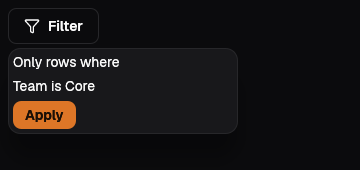 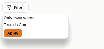
## Examples
### Details on demand
A button and a panel; Esc or a click outside closes it.
```rust
Popover { id: "pop-who", label: "Who can see this" }.render(
out,
|out| out.push_str("Everyone in Acme with the viewer role.
"),
);
```
### Holding parts
A popover can hold any part.
```rust
Popover { id: "pop-status", label: "Agent status" }.render(
out,
|out| {
Status { word: "Working".into(), tone: Tone::Ok }.html(out);
Progress { label: "Today's budget".into(), value: 3.2, max: 10.0 }.html(out);
},
);
```
### Help beside a field
A short explanation, never the only path to it.
```rust
Popover { id: "pop-help", label: "What is a source" }.render(
out,
|out| out.push_str("A table or inline rows a block reads.
"),
);
```
## Accessibility
- The opener is a real button tied to the panel by popovertarget, so the browser reports whether it is open.
- The panel is not modal; Esc or a click outside closes it and the rest of the page stays reachable.
- Give the panel a heading or label inside when the button's words do not say what it holds.
## Related
- [Menu](/ui/components/menu.md)
- [Dialog](/ui/components/dialog.md)
- [Button](/ui/components/button.md)