Plunge, then rise: the design of PlungeAI
A new wordmark with a sun on the i, one colour called Fresh mint, two typefaces and numbers drawn in dots. A tour of the PlungeAI design and the rules behind it.
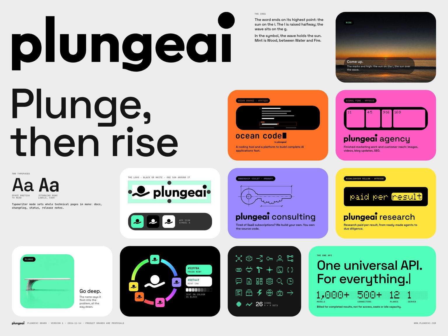
We spent the autumn redrawing PlungeAI from the first letter up: a new wordmark, a new symbol, one colour, two typefaces and a set of parts that every page, slide and app screen is now built from. This is the tour. It is long, because we are proud of it.
The whole brand fits on one poster, so we start there.
The idea: plunge, then rise
The name starts with a dive. You go into a problem, all the way down, and you come back up with something that works. We wanted the marks to tell that story without a single word of explanation next to them, so both of them end on their highest point.

The wordmark
The wordmark is the logo. It is lowercase, it is drawn and not typed, and three small decisions carry the idea.
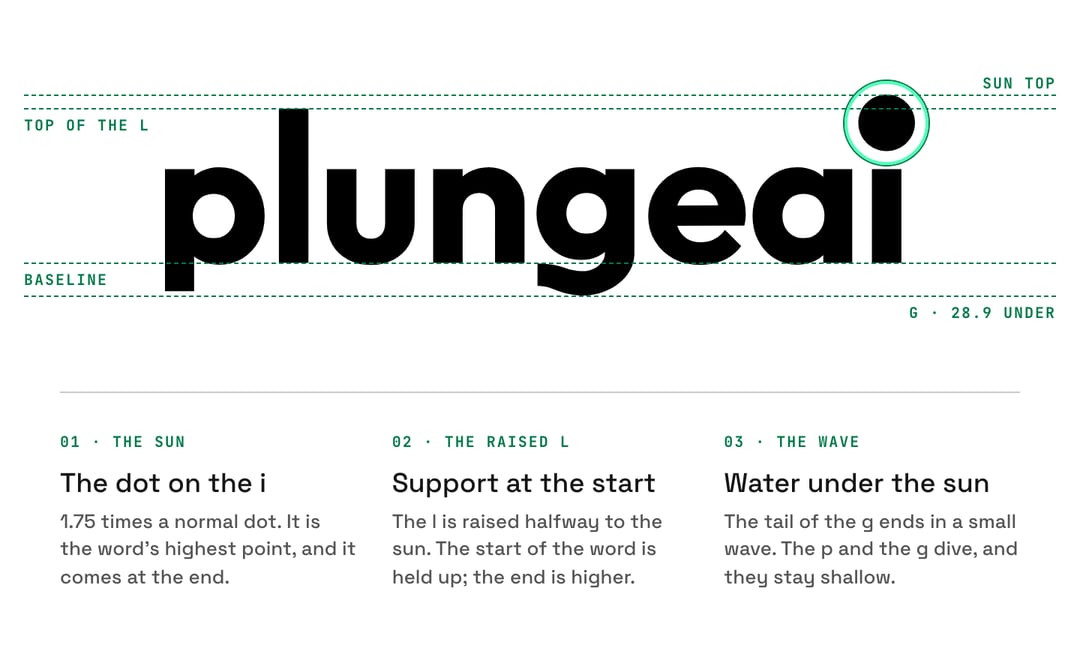
- The sun. The dot on the i is 1.75 times a normal dot. It is the highest point of the word, and it sits at the end, where you finish reading.
- The raised l. The l is raised halfway to the sun. The start of the word is held up, and the end is still higher.
- The wave. The tail of the g ends in a small wave: water under the sun. The p and the g dive below the baseline, and the dive stays shallow.
Type the name in a font and all three disappear. That is why the logo is always the file, never the keyboard. In running text the name is written PlungeAI: one word, capital P, A and I.
The symbol and the lockup
Where the word does not fit, the symbol stands alone: a sun held by one wave. It is the app icon, the favicon and the avatar. Where both must appear, there is one lockup, horizontal only, with the symbol on the left.
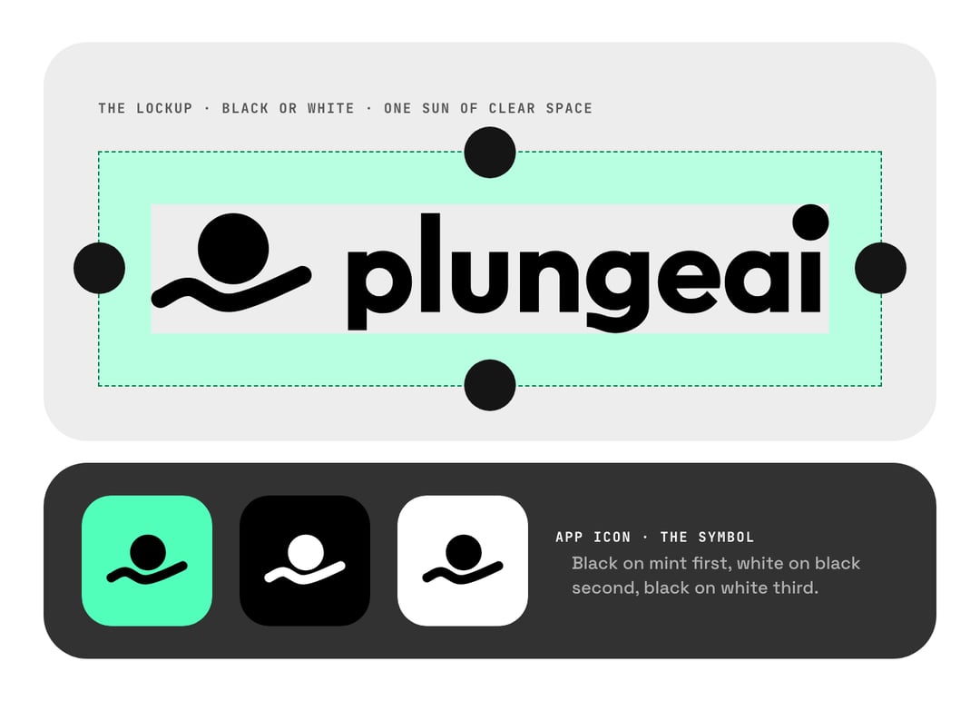
Two rules keep it calm. The clear space on every side is one sun, the diameter of the i's dot. And the logo is black or white, never mint and never a product colour. The colour belongs to the ground the logo sits on.
One colour: Fresh mint
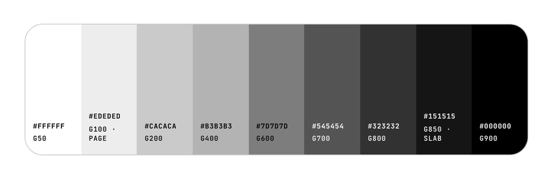
Grey and black carry every page. The page is #EDEDED, the dark slabs are #151515, and there is exactly one company colour.
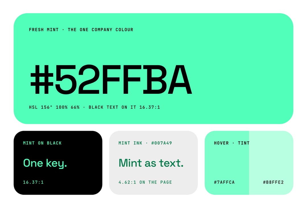
Fresh mint is #52FFBA, hue 156°, fully saturated. It fills the primary button, the app-icon tile, the focus ring, the selection and the footer. On black it colours type and numerals, at a contrast of 16.37:1.
It is loud, so we use very little of it. On our own website, mint covers between 0.7 and 1.6 percent of a screen, and only the footer is a mint field. One mint button leads each view. With four mint parts on a screen, nothing leads.
Mint is too light to read on a light ground (1.28:1 on white), so mint never appears there as text. Links and small coloured words on light use mint ink, #007A49, which reads at 5.41:1 on white.
| Colour | Hex | Where it goes |
|---|---|---|
| Fresh mint | #52FFBA | The one call to action, the app icon, focus, selection, the footer |
| Mint ink | #007A49 | Mint as text and links on light grounds |
| Page | #EDEDED | The ground of every page |
| Slab | #151515 | Dark blocks, and text on light |
| Black | #000000 | Tiles inside slabs, code, the logo |
| Small grey text | #545454 | Labels and secondary text on light |
Four products, four colours
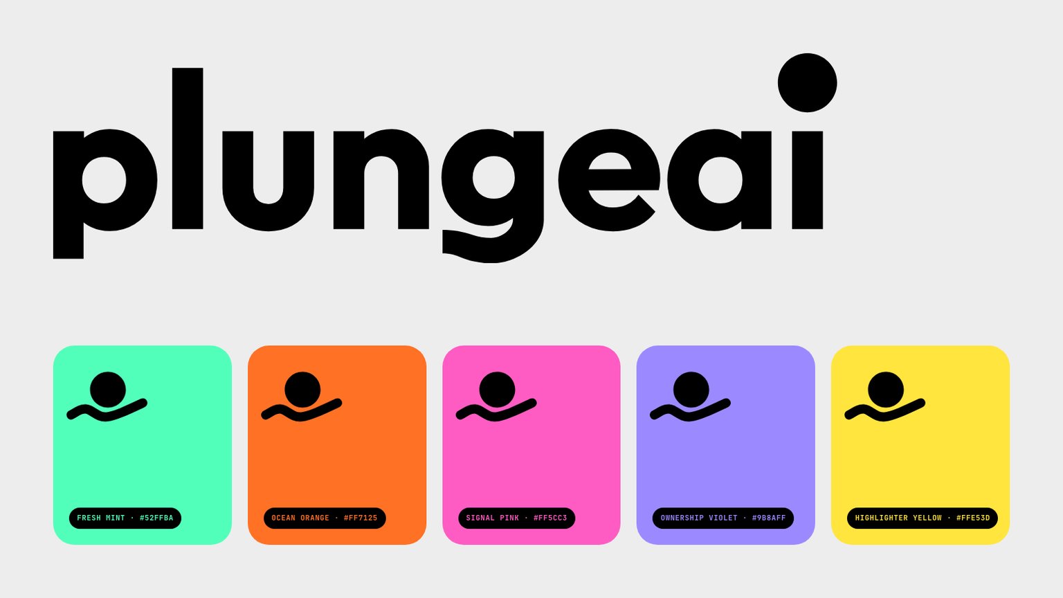
PlungeAI is the company and the One API. The products built on it each get one colour of their own. We set three tests for a product colour: as bright as the mint, black text readable on it at 7:1 or better, and at least 30° of hue away from the mint and from every other product.
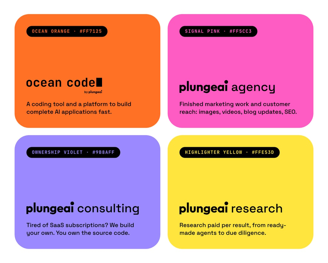
| Product | Colour | Hex |
|---|---|---|
| Ocean Code | Ocean orange | #FF7125 |
| PlungeAI Agency | Signal pink | #FF5CC3 |
| PlungeAI Consulting | Ownership violet | #9B8AFF |
| PlungeAI Research | Highlighter yellow | #FFE53D |
A product's site wears only its own colour and its own lockup. The parts, the greys and the type stay the same, so you always know whose house you are in.
Two typefaces
Space Grotesk is for everything you read. JetBrains Mono is for everything small and uppercase: buttons, labels, chips, and code.
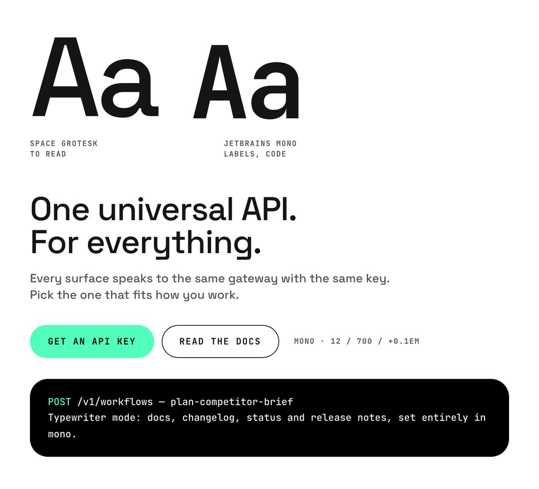
Headings are sentence case at one weight, 500, and they close up by a hair. Mono labels do the opposite: they open up and go uppercase, so a button never looks like a sentence. Buttons are pills, 44 px tall.
Mono has a second job, which we call typewriter mode. Whole technical pages are set in it: the docs, the changelog, the status page and release notes. When a page turns to mono, you know you are reading something you can run.
The dotted numerals
This is the part people ask about. Our big numbers are drawn in dots.
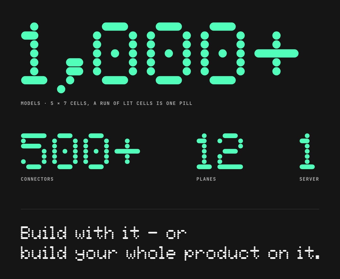
It is the classic 5 × 7 LCD face, the one on calculators and departure boards. We changed one thing: a horizontal run of lit cells joins into a single pill, and a lone cell stays a dot. That gives the letters their soft, counted look. Watch the l and the H in a line of dotted text: the stems are stacks of single dots, and the crossbars are pills.
We keep it rare. Dots are for numerals and for one closing sentence on a page, never for body text. On the website the dots pop in as the number scrolls into view, and they stay still for anyone who has asked for reduced motion.
Icons and patterns
The same dots draw our icons. There are 26, each on a 9 × 9 grid, and they are pictures, not controls: we show them at 48 px or larger.
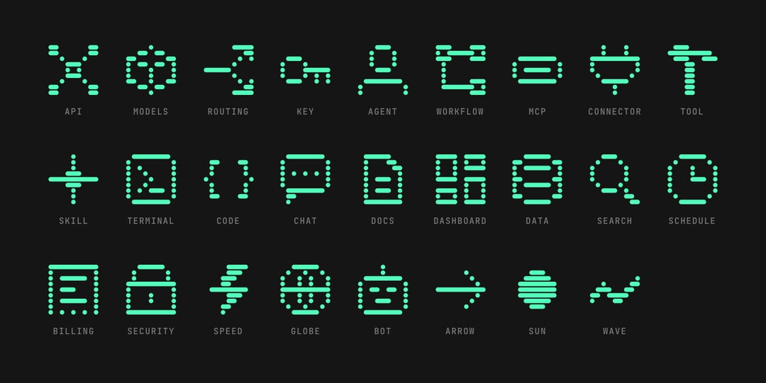
Around them sits a small family of patterns from the same language: a dot field like the unlit cells of a display, scanlines, loose pills, and the symbol's wave drawn as climbing lines. They go flat behind the content, one per area, and always quiet.
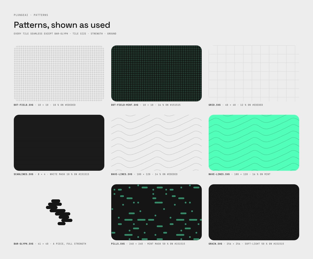
Slabs, tiles and pills
The layout has three shapes. Dark content sits in rounded slabs with 32 px corners. Objects sit in black tiles inside them, with 24 px corners. Small words sit on pills. There are no shadows on cards: depth comes from the slab, the edge of the tile and a thin glass rim.
Photographs follow one rule as well: one object per idea, and the idea keeps its object. The scale is always model routing. The dominoes are always workflows.
One system, everywhere
A brand is only real when it holds up on a slide at nine in the morning. So the same parts make the presentation template, the business card, the letterhead and the social formats.
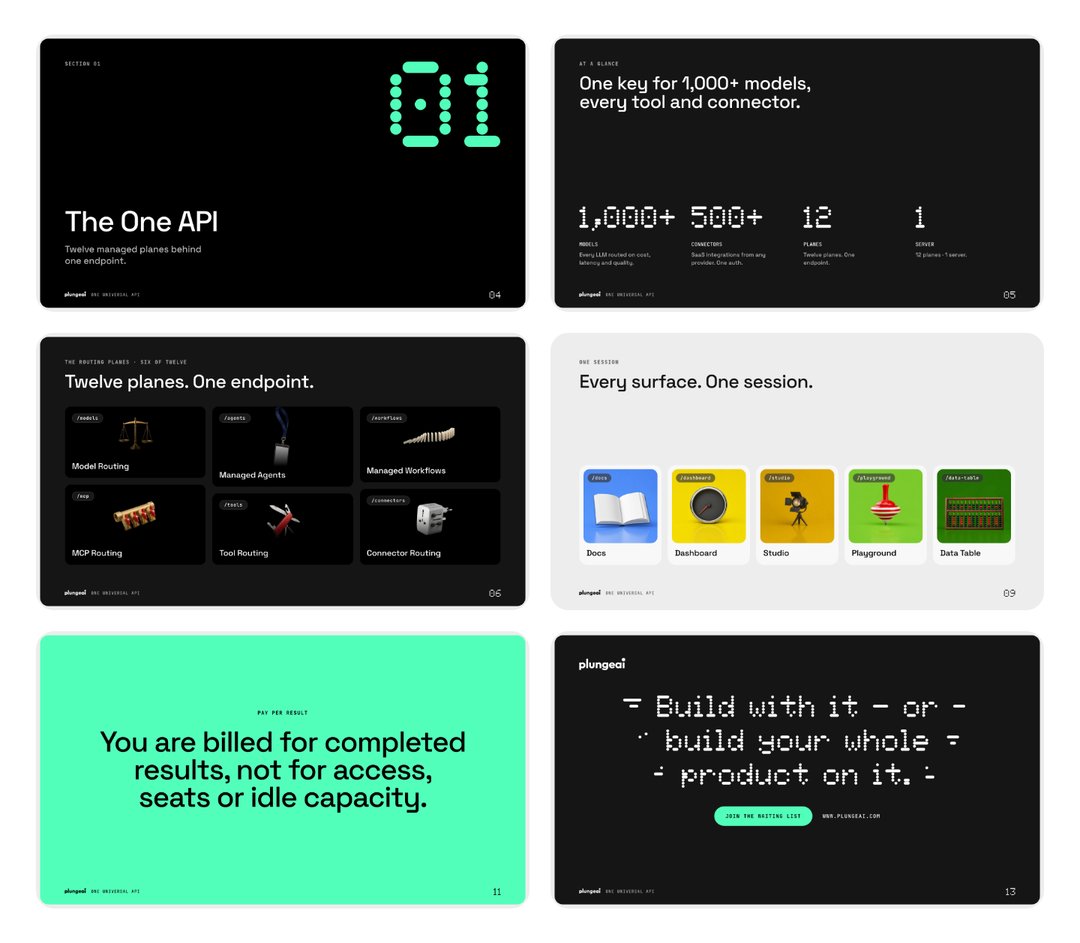
The website, the docs and the signed-in apps run on the same tokens: the same two typefaces, the same greys, the same mint.
What we held ourselves to
- One colour, used once. If everything is mint, nothing is.
- The logo is black or white. The colour belongs to the ground.
- Two typefaces. One to read, one to label.
- Dots are for numbers. And for one last sentence.
- Readable first. Text under 24 px meets 4.5:1 or it does not ship.
- No shadows. Depth comes from shape.
- End high. The word does, the symbol does, and so should the page.
The logo files, the colours and the rules for using them are on the press and brand page and in the brand package.