Button
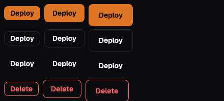
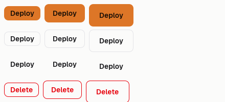
The one filled button on a screen is its primary action; secondary actions are outlined and quiet ones are ghost. A destructive action is the Danger variant, placed last and never a red fill: both faces outline it in the bad tone. A busy button says what it is doing ("Saving…") and takes no clicks; on the web a button with an href is written as a link so it works without script, and the native face ignores href.
Variants
One solid button per screen; outline for the rest, ghost when quiet, danger last.
Button::new("Save", Variant::Solid).html(out);
Button::new("Preview", Variant::Outline).html(out);
Button::new("Cancel", Variant::Ghost).html(out);
Button::new("Delete", Variant::Danger).html(out);Sizes
32 px in dense tools, 36 px by default, 44 px for a public call to action.
Button::new("Small", Variant::Outline).size(Size::Sm).html(out);
Button::new("Medium", Variant::Outline).html(out);
Button::new("Large", Variant::Solid).size(Size::Lg).html(out);With an icon
The icon sits before the label; the label still names the action.
Button::new("New ticket", Variant::Solid).icon(Icon::Plus).html(out);
Button::new("Export", Variant::Outline).icon(Icon::Download).html(out);States
Busy says what it is doing and takes no clicks; disabled fades to 40 percent.
Button::new("Saving", Variant::Solid).busy(true).html(out);
Button::new("Publish", Variant::Outline).disabled(true).html(out);As a link
With an address the button is a link, so it works without script.
Button::new("Browse components", Variant::Outline).href("/ui/components")On the Mac
The same vocabulary drawn by Ocean UI's native face (egui on Metal), as the gallery's snapshot.
Use it
Web
use ocean_ui_core::{Button, Size, Variant};
Button::new("Save", Variant::Solid).size(Size::Md)Native
use ocean_ui_native::{Show, core::{Button, Size, Variant}};
Button::new("Deploy", Variant::Solid).size(Size::Md).show(ui);Cargo feature base of ocean-ui-core, ocean-ui-web and ocean-ui-native; available since 2026-10-29.
In App UI, the button block draws it from YAML.
Props
| Name | Type | Default | What |
|---|---|---|---|
label | String | — | The words on the button, a verb in sentence case. |
variant | Variant | — | Solid, Outline, Ghost or Danger: how much the button stands out. |
size | Size | Md | Sm, Md or Lg: 32, 36 or 44 px on the web and 28, 36 or 44 pt native; Lg is the public call to action. |
icon | Option<Icon> | None | An icon before the label. |
busy | bool | false | Working on it; the web face shows the busy label ("Working…" unless busy_label says otherwise) with aria-busy and takes no clicks; the native face shows a spinner. |
disabled | bool | false | Takes no clicks and is dimmed. |
href | Option<String> | None | An address; the web face writes the button as a link and the native face ignores it. |
Accessibility
- The label is the accessible name, so an icon-only button needs words in its label.
- A busy or disabled button says so with aria-busy and disabled, or aria-disabled when it is a link.
- Focus shows a 2 px ring in the theme's ring colour; under a coarse pointer the target is at least 44 px.
Related
Markdown
The same page as Markdown, for an agent or a pull request.
# Button
A labelled action in four emphases and three sizes; on the web an address makes it a link that looks the same.
The one filled button on a screen is its primary action; secondary actions are outlined and quiet ones are ghost. A destructive action is the Danger variant, placed last and never a red fill: both faces outline it in the bad tone. A busy button says what it is doing ("Saving…") and takes no clicks; on the web a button with an href is written as a link so it works without script, and the native face ignores href.
## Use it
Web:
```rust
use ocean_ui_core::{Button, Size, Variant};
Button::new("Save", Variant::Solid).size(Size::Md)
```
Native:
```rust
use ocean_ui_native::{Show, core::{Button, Size, Variant}};
Button::new("Deploy", Variant::Solid).size(Size::Md).show(ui);
```
Cargo feature `base`; since 2026-10-29.
In App UI the `button` block draws it ([button](/ui/blocks/button.md)).
## Props
| Name | Type | Default | What |
|---|---|---|---|
| `label` | `String` | `—` | The words on the button, a verb in sentence case. |
| `variant` | `Variant` | `—` | Solid, Outline, Ghost or Danger: how much the button stands out. |
| `size` | `Size` | `Md` | Sm, Md or Lg: 32, 36 or 44 px on the web and 28, 36 or 44 pt native; Lg is the public call to action. |
| `icon` | `Option<Icon>` | `None` | An icon before the label. |
| `busy` | `bool` | `false` | Working on it; the web face shows the busy label ("Working…" unless busy_label says otherwise) with aria-busy and takes no clicks; the native face shows a spinner. |
| `disabled` | `bool` | `false` | Takes no clicks and is dimmed. |
| `href` | `Option<String>` | `None` | An address; the web face writes the button as a link and the native face ignores it. |
On the Mac:  
## Examples
### Variants
One solid button per screen; outline for the rest, ghost when quiet, danger last.
```rust
Button::new("Save", Variant::Solid).html(out);
Button::new("Preview", Variant::Outline).html(out);
Button::new("Cancel", Variant::Ghost).html(out);
Button::new("Delete", Variant::Danger).html(out);
```
### Sizes
32 px in dense tools, 36 px by default, 44 px for a public call to action.
```rust
Button::new("Small", Variant::Outline).size(Size::Sm).html(out);
Button::new("Medium", Variant::Outline).html(out);
Button::new("Large", Variant::Solid).size(Size::Lg).html(out);
```
### With an icon
The icon sits before the label; the label still names the action.
```rust
Button::new("New ticket", Variant::Solid).icon(Icon::Plus).html(out);
Button::new("Export", Variant::Outline).icon(Icon::Download).html(out);
```
### States
Busy says what it is doing and takes no clicks; disabled fades to 40 percent.
```rust
Button::new("Saving", Variant::Solid).busy(true).html(out);
Button::new("Publish", Variant::Outline).disabled(true).html(out);
```
### As a link
With an address the button is a link, so it works without script.
```rust
Button::new("Browse components", Variant::Outline).href("/ui/components")
```
## Accessibility
- The label is the accessible name, so an icon-only button needs words in its label.
- A busy or disabled button says so with aria-busy and disabled, or aria-disabled when it is a link.
- Focus shows a 2 px ring in the theme's ring colour; under a coarse pointer the target is at least 44 px.
## Related
- [Copy button](/ui/components/copy.md)
- [Menu](/ui/components/menu.md)
- [Dialog](/ui/components/dialog.md)