Tooltip
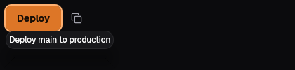
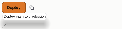
A tooltip says what a control does when its label cannot, most often an icon button. It draws in its own layer, in the popover frame and small type, and opens on hover and on keyboard focus. Keep it to a few words in sentence case. The web face does not draw it yet.
No web face yet
Today the Mac draws it through ocean-ui-native; the web face does not draw it yet.
On the Mac
The same vocabulary drawn by Ocean UI's native face (egui on Metal), as the gallery's snapshot.
Use it
Native
use ocean_ui_native::{Show, widgets::Tooltip};
Tooltip { anchor: deploy, text: "Deploy main to production".into() }.show(ui)Cargo feature base of ocean-ui-native; available since 2026-10-29.
Props
| Name | Type | Default | What |
|---|---|---|---|
anchor | Response | — | The control the tip belongs to; show returns its response. |
text | String | — | The few words shown, in sentence case. |
Accessibility
- The tip opens on keyboard focus as well as on hover, so it reaches people who never use a pointer.
- The tip is not the control's accessible name; give the control the same words, as icon_button does with its label.
- A tip cannot be clicked, so never put an action or a link in it.
Related
Markdown
The same page as Markdown, for an agent or a pull request.
# Tooltip
Words beside a control, shown while the pointer is over it or it has keyboard focus.
A tooltip says what a control does when its label cannot, most often an icon button. It draws in its own layer, in the popover frame and small type, and opens on hover and on keyboard focus. Keep it to a few words in sentence case. The web face does not draw it yet.
## Use it
No web face yet: the Mac draws it through `ocean-ui-native`.
Native:
```rust
use ocean_ui_native::{Show, widgets::Tooltip};
Tooltip { anchor: deploy, text: "Deploy main to production".into() }.show(ui)
```
Cargo feature `base`; since 2026-10-29.
## Props
| Name | Type | Default | What |
|---|---|---|---|
| `anchor` | `Response` | `—` | The control the tip belongs to; show returns its response. |
| `text` | `String` | `—` | The few words shown, in sentence case. |
On the Mac:  
## Accessibility
- The tip opens on keyboard focus as well as on hover, so it reaches people who never use a pointer.
- The tip is not the control's accessible name; give the control the same words, as icon_button does with its label.
- A tip cannot be clicked, so never put an action or a link in it.
## Related
- [Button](/ui/components/button.md)
- [Popover](/ui/components/popover.md)
- [Keyboard shortcut](/ui/components/kbd.md)