Progress
Progress shows how far a known amount of work has gone, such as an import, a quota or a step in a run. The fill is value over max, clamped between empty and full, and the percentage is shown as a whole number. When max is not positive or either number is not finite, the bar reads 0 percent rather than guessing.
Under way
A label and the share done.
Import42%
Progress { label: "Import".into(), value: 42.0, max: 100.0 }From counts
Value and max can be any counts; the bar shows the fraction.
Tickets triaged75%
Progress { label: "Tickets triaged".into(), value: 18.0, max: 24.0 }Start and finish
Empty and full are states too.
Queued0%
Done100%
Progress { label: "Queued".into(), value: 0.0, max: 10.0 }.html(out);
Progress { label: "Done".into(), value: 10.0, max: 10.0 }.html(out);On the Mac
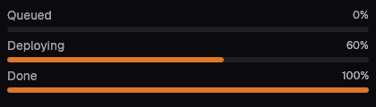
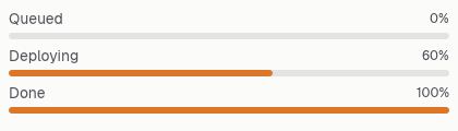
The same vocabulary drawn by Ocean UI's native face (egui on Metal), as the gallery's snapshot.
Use it
Web
use ocean_ui_core::Progress;
Progress { label: "Importing rows".into(), value: 420.0, max: 1000.0 }Native
use ocean_ui_native::{Show, core::Progress};
Progress { label: "Deploying".into(), value: 3.0, max: 5.0 }.show(ui);Cargo feature base of ocean-ui-core, ocean-ui-web and ocean-ui-native; available since 2026-10-29.
In App UI, the progress block draws it from YAML.
Props
| Name | Type | Default | What |
|---|---|---|---|
label | String | — | What is in progress, in sentence case. |
value | f32 | — | How much is done, in the same unit as max. |
max | f32 | — | The whole amount; the bar is full when value reaches it. |
Accessibility
- The bar is a native progress element with max 1 and the fraction as its value, so assistive technology reads how far it has gone.
- The label and the percentage are text above the bar and are not tied to it by aria-labelledby, so keep the label next to the bar.
- Progress always has a value; for work of unknown length, show a skeleton instead.
Related
Markdown
The same page as Markdown, for an agent or a pull request.
# Progress
A labelled bar that fills from value over max, with the whole percentage written beside the label.
Progress shows how far a known amount of work has gone, such as an import, a quota or a step in a run. The fill is value over max, clamped between empty and full, and the percentage is shown as a whole number. When max is not positive or either number is not finite, the bar reads 0 percent rather than guessing.
## Use it
Web:
```rust
use ocean_ui_core::Progress;
Progress { label: "Importing rows".into(), value: 420.0, max: 1000.0 }
```
Native:
```rust
use ocean_ui_native::{Show, core::Progress};
Progress { label: "Deploying".into(), value: 3.0, max: 5.0 }.show(ui);
```
Cargo feature `base`; since 2026-10-29.
In App UI the `progress` block draws it ([progress](/ui/blocks/progress.md)).
## Props
| Name | Type | Default | What |
|---|---|---|---|
| `label` | `String` | `—` | What is in progress, in sentence case. |
| `value` | `f32` | `—` | How much is done, in the same unit as max. |
| `max` | `f32` | `—` | The whole amount; the bar is full when value reaches it. |
On the Mac:  
## Examples
### Under way
A label and the share done.
```rust
Progress { label: "Import".into(), value: 42.0, max: 100.0 }
```
### From counts
Value and max can be any counts; the bar shows the fraction.
```rust
Progress { label: "Tickets triaged".into(), value: 18.0, max: 24.0 }
```
### Start and finish
Empty and full are states too.
```rust
Progress { label: "Queued".into(), value: 0.0, max: 10.0 }.html(out);
Progress { label: "Done".into(), value: 10.0, max: 10.0 }.html(out);
```
## Accessibility
- The bar is a native progress element with max 1 and the fraction as its value, so assistive technology reads how far it has gone.
- The label and the percentage are text above the bar and are not tied to it by aria-labelledby, so keep the label next to the bar.
- Progress always has a value; for work of unknown length, show a skeleton instead.
## Related
- [Skeleton](/ui/components/skeleton.md)
- [KPI](/ui/components/kpi.md)
- [Donut](/ui/components/donut.md)