Collapsible
A collapsible keeps secondary detail out of the way until someone asks for it. It is a <details> with its summary, so it works by keyboard and without script, and open sets whether it starts expanded. Keep the summary short and specific about what is inside.
Closed
The summary names what opens.
Advanced settings
Retries, timeouts and the model.
Collapsible { summary: "Advanced settings", open: false }.render(
    out,
    |out| out.push_str("<p>Retries, timeouts and the model.</p>"),
);Open
Starts open when the content matters first.
What the agent may do
Read tickets, draft replies, ask a person before refunds.
Collapsible { summary: "What the agent may do", open: true }.render(
    out,
    |out| out.push_str("<p>Read tickets, draft replies, ask a person before refunds.</p>"),
);Stacked
Several in a row read like a list of questions.
Is it free?
The builder is free; runs are metered.
Where is data kept?
In your Ocean Base database.
for (q, a) in [
    ("Is it free?", "The builder is free; runs are metered."),
    ("Where is data kept?", "In your Ocean Base database."),
] {
    Collapsible { summary: q, open: false }.render(
        out,
        |out| { out.push_str("<p>"); out.push_str(a); out.push_str("</p>"); },
    );,
}On the Mac
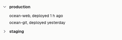
The same vocabulary drawn by Ocean UI's native face (egui on Metal), as the gallery's snapshot.

Use it
Web
use ocean_ui_web::Collapsible;
Collapsible { summary: "Advanced", open: false }.render(&mut out, |out| out.push_str("…"))Native
use ocean_ui_native::containers::Collapsible;
Collapsible { summary: "production".into(), open: &mut open }.show(ui, |ui| ui.label("ocean-web, deployed 1 h ago"))Cargo feature base of ocean-ui-core, ocean-ui-web and ocean-ui-native; available since 2026-10-29.
Props
| Name | Type | Default | What |
|---|---|---|---|
summary | &str | — | The line that stays in view and opens and shuts the section. |
open | bool | false | Starts expanded. |
Accessibility
- The summary is the browser's own disclosure control; Enter or Space toggles it and its expanded state is reported.
- The content of a closed section is hidden from assistive technology until it opens.
Related
Markdown
The same page as Markdown, for an agent or a pull request.
# Collapsible
A section that opens and shuts under a one-line summary, the browser's details element.
A collapsible keeps secondary detail out of the way until someone asks for it. It is a <details> with its summary, so it works by keyboard and without script, and open sets whether it starts expanded. Keep the summary short and specific about what is inside.
## Use it
Web:
```rust
use ocean_ui_web::Collapsible;
Collapsible { summary: "Advanced", open: false }.render(&mut out, |out| out.push_str("…"))
```
Native:
```rust
use ocean_ui_native::containers::Collapsible;
Collapsible { summary: "production".into(), open: &mut open }.show(ui, |ui| ui.label("ocean-web, deployed 1 h ago"))
```
Cargo feature `base`; since 2026-10-29.
## Props
| Name | Type | Default | What |
|---|---|---|---|
| `summary` | `&str` | `—` | The line that stays in view and opens and shuts the section. |
| `open` | `bool` | `false` | Starts expanded. |
On the Mac:  
## Examples
### Closed
The summary names what opens.
```rust
Collapsible { summary: "Advanced settings", open: false }.render(
out,
|out| out.push_str("<p>Retries, timeouts and the model.</p>"),
);
```
### Open
Starts open when the content matters first.
```rust
Collapsible { summary: "What the agent may do", open: true }.render(
out,
|out| out.push_str("<p>Read tickets, draft replies, ask a person before refunds.</p>"),
);
```
### Stacked
Several in a row read like a list of questions.
```rust
for (q, a) in [
("Is it free?", "The builder is free; runs are metered."),
("Where is data kept?", "In your Ocean Base database."),
] {
Collapsible { summary: q, open: false }.render(
out,
|out| { out.push_str("<p>"); out.push_str(a); out.push_str("</p>"); },
);,
}
```
## Accessibility
- The summary is the browser's own disclosure control; Enter or Space toggles it and its expanded state is reported.
- The content of a closed section is hidden from assistive technology until it opens.
## Related
- [Card](/ui/components/card.md)
- [Tabs](/ui/components/tabs.md)
- [Popover](/ui/components/popover.md)