Field
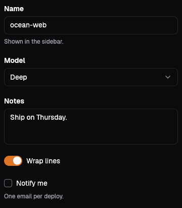
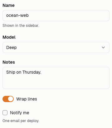
A field ties a label and an optional hint to one control; on the web the control's id and name are the field's id, so a plain form post carries it, and natively Pick hands back the control with the person's edit. Control::Input { value, placeholder } is a one-line text box, Select { options, value } a list of (value, label) choices, Textarea { value, rows } a box of several lines, and Switch(bool) and Checkbox(bool) an on or off box drawn on one row with its label. The default control is an empty Input.
Text input
The label above, the help below, tied to the input.
People see this name in the queue.
Field {
    id: "f-name".into(),
    label: "Agent name".into(),
    hint: Some("People see this name in the queue.".into()),
    control: Control::Input {
        value: String::new(),
        placeholder: "Triage agent".into(),
    },
}Select
A closed list of choices; the current one selected.
Field {
    id: "f-tone".into(),
    label: "Priority".into(),
    hint: None,
    control: Control::Select {
        options: vec![
            ("low".into(), "Low".into()),
            ("normal".into(), "Normal".into()),
            ("high".into(), "High".into()),
        ],
        value: "normal".into(),
    },
}Textarea
Room for a few lines; rows set its height.
Plain language; the agent follows it.
Field {
    id: "f-notes".into(),
    label: "Instructions".into(),
    hint: Some("Plain language; the agent follows it.".into()),
    control: Control::Textarea { value: String::new(), rows: 4 },
}Switch and checkbox
On and off controls put the label beside them.
Field {
    id: "f-live".into(),
    label: "Answer customers directly".into(),
    hint: None,
    control: Control::Switch(true),
}.html(out);
Field {
    id: "f-terms".into(),
    label: "Ask a person before refunds".into(),
    hint: None,
    control: Control::Checkbox(false),
}.html(out);Required
Required is said in the label, not by a colour.
Replies go to this address.
Field {
    id: "f-email".into(),
    label: "Work email (required)".into(),
    hint: Some("Replies go to this address.".into()),
    control: Control::Input {
        value: "maya@".into(),
        placeholder: "name@company.com".into(),
    },
}On the Mac
The same vocabulary drawn by Ocean UI's native face (egui on Metal), as the gallery's snapshot.
Use it
Web
use ocean_ui_core::{Control, Field};
let control = Control::Select { options: vec![("p1".into(), "Urgent".into())], value: "p1".into() };
Field { id: "priority".into(), label: "Priority".into(), hint: Some("Urgent pages the on-call.".into()), control }Native
use ocean_ui_native::{core::{Control, Field}, widgets::Pick};
let field = Field { id: "wrap".into(), label: "Wrap lines".into(), hint: None, control: Control::Switch(true) };
let edited: Option<Control> = field.pick(ui).value;Cargo feature forms of ocean-ui-core, ocean-ui-web and ocean-ui-native; available since 2026-10-29.
In App UI, the form block draws it from YAML.
Props
| Name | Type | Default | What |
|---|---|---|---|
id | String | — | The control's id and name, and the start of the hint's id. |
label | String | — | What the field asks for, in sentence case. |
hint | Option<String> | None | One sentence under the control, tied to it by aria-describedby. |
control | Control | Input | Input, Select, Textarea, Switch or Checkbox, with its value. |
Accessibility
- The label is a label element whose for names the control, so clicking it focuses or toggles the control.
- A hint is tied to the control by aria-describedby, so it is read after the label.
- A switch is a checkbox with role="switch", announced as on or off; a checkbox is announced as checked or not.
- Every control is a native element, so the keyboard works as the browser defines.
Related
Markdown
The same page as Markdown, for an agent or a pull request.
# Field
A labelled form control with an optional hint, posted under the field's id without any script.
A field ties a label and an optional hint to one control; on the web the control's id and name are the field's id, so a plain form post carries it, and natively Pick hands back the control with the person's edit. Control::Input { value, placeholder } is a one-line text box, Select { options, value } a list of (value, label) choices, Textarea { value, rows } a box of several lines, and Switch(bool) and Checkbox(bool) an on or off box drawn on one row with its label. The default control is an empty Input.
## Use it
Web:
```rust
use ocean_ui_core::{Control, Field};
let control = Control::Select { options: vec![("p1".into(), "Urgent".into())], value: "p1".into() };
Field { id: "priority".into(), label: "Priority".into(), hint: Some("Urgent pages the on-call.".into()), control }
```
Native:
```rust
use ocean_ui_native::{core::{Control, Field}, widgets::Pick};
let field = Field { id: "wrap".into(), label: "Wrap lines".into(), hint: None, control: Control::Switch(true) };
let edited: Option<Control> = field.pick(ui).value;
```
Cargo feature `forms`; since 2026-10-29.
In App UI the `form` block draws it ([form](/ui/blocks/form.md)).
## Props
| Name | Type | Default | What |
|---|---|---|---|
| `id` | `String` | `—` | The control's id and name, and the start of the hint's id. |
| `label` | `String` | `—` | What the field asks for, in sentence case. |
| `hint` | `Option<String>` | `None` | One sentence under the control, tied to it by aria-describedby. |
| `control` | `Control` | `Input` | Input, Select, Textarea, Switch or Checkbox, with its value. |
On the Mac:  
## Examples
### Text input
The label above, the help below, tied to the input.
```rust
Field {
id: "f-name".into(),
label: "Agent name".into(),
hint: Some("People see this name in the queue.".into()),
control: Control::Input {
value: String::new(),
placeholder: "Triage agent".into(),
},
}
```
### Select
A closed list of choices; the current one selected.
```rust
Field {
id: "f-tone".into(),
label: "Priority".into(),
hint: None,
control: Control::Select {
options: vec![
("low".into(), "Low".into()),
("normal".into(), "Normal".into()),
("high".into(), "High".into()),
],
value: "normal".into(),
},
}
```
### Textarea
Room for a few lines; rows set its height.
```rust
Field {
id: "f-notes".into(),
label: "Instructions".into(),
hint: Some("Plain language; the agent follows it.".into()),
control: Control::Textarea { value: String::new(), rows: 4 },
}
```
### Switch and checkbox
On and off controls put the label beside them.
```rust
Field {
id: "f-live".into(),
label: "Answer customers directly".into(),
hint: None,
control: Control::Switch(true),
}.html(out);
Field {
id: "f-terms".into(),
label: "Ask a person before refunds".into(),
hint: None,
control: Control::Checkbox(false),
}.html(out);
```
### Required
Required is said in the label, not by a colour.
```rust
Field {
id: "f-email".into(),
label: "Work email (required)".into(),
hint: Some("Replies go to this address.".into()),
control: Control::Input {
value: "maya@".into(),
placeholder: "name@company.com".into(),
},
}
```
## Accessibility
- The label is a label element whose for names the control, so clicking it focuses or toggles the control.
- A hint is tied to the control by aria-describedby, so it is read after the label.
- A switch is a checkbox with role="switch", announced as on or off; a checkbox is announced as checked or not.
- Every control is a native element, so the keyboard works as the browser defines.
## Related
- [Segmented](/ui/components/segmented.md)
- [Dialog](/ui/components/dialog.md)
- [Button](/ui/components/button.md)