Card
A card groups one subject: a heading, a line that explains it and at most one action at the end of its head. The body is written by a closure into the same string, so any part can sit inside. Use cards to separate subjects, not to frame every element.
Title and body
A card groups one thing: a head over its content.
Acme renewal
Due in 12 days
Card { title: "Acme renewal", description: Some("Due in 12 days"), action: None }.render(
    out,
    |out| { Status { word: "On track".into(), tone: Tone::Ok }.html(out); },
);With an action
One action in the head, a link or a quiet button.
Import
let open = Button::new("Open", Variant::Ghost).size(Size::Sm).href("#card");
Card { title: "Import", description: None, action: Some(&open) }.render(
    out,
    |out| {
        Progress { label: "Rows".into(), value: 640.0, max: 1000.0 }.html(out);,
    },
);Holding parts
Any part goes inside: badges, figures, a list.
Plan
Team, billed yearly
Twelve seats, unlimited apps.
Card { title: "Plan", description: Some("Team, billed yearly"), action: None }.render(
    out,
    |out| {
        Badge { text: "Current".into(), tone: Tone::Brand }.html(out);
        out.push_str("<p>Twelve seats, unlimited apps.</p>");
    },
);On the Mac
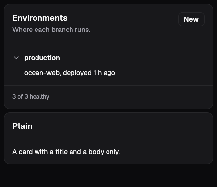
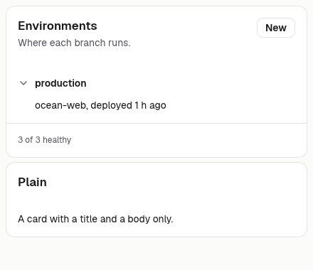
The same vocabulary drawn by Ocean UI's native face (egui on Metal), as the gallery's snapshot.
Use it
Web
use ocean_ui_web::Card;
Card { title: "Plan", description: None, action: None }.render(&mut out, |out| out.push_str("…"))Native
use ocean_ui_core::{Button, Size, Variant};
use ocean_ui_native::containers::Card;
let new = Button::new("New", Variant::Outline).size(Size::Sm);
Card::new("Environments").description("Where each branch runs.").action(new).show(ui, |ui| ui.label("…"))Cargo feature base of ocean-ui-core, ocean-ui-web and ocean-ui-native; available since 2026-10-29.
In App UI, the card block draws it from YAML.
Props
| Name | Type | Default | What |
|---|---|---|---|
title | &str | — | The card's heading, written as an h2. |
description | Option<&str> | None | One line under the title. |
action | Option<&dyn Html> | None | One part at the end of the head, usually a button or a menu. |
Accessibility
- The card is a section headed by an h2, so it takes its place in the outline under the page head's h1.
- The action keeps its own role and name; the card adds none.
Related
Markdown
The same page as Markdown, for an agent or a pull request.
# Card
A titled section with an optional description and one action, around a body the caller writes.
A card groups one subject: a heading, a line that explains it and at most one action at the end of its head. The body is written by a closure into the same string, so any part can sit inside. Use cards to separate subjects, not to frame every element.
## Use it
Web:
```rust
use ocean_ui_web::Card;
Card { title: "Plan", description: None, action: None }.render(&mut out, |out| out.push_str("…"))
```
Native:
```rust
use ocean_ui_core::{Button, Size, Variant};
use ocean_ui_native::containers::Card;
let new = Button::new("New", Variant::Outline).size(Size::Sm);
Card::new("Environments").description("Where each branch runs.").action(new).show(ui, |ui| ui.label("…"))
```
Cargo feature `base`; since 2026-10-29.
In App UI the `card` block draws it ([card](/ui/blocks/card.md)).
## Props
| Name | Type | Default | What |
|---|---|---|---|
| `title` | `&str` | `—` | The card's heading, written as an h2. |
| `description` | `Option<&str>` | `None` | One line under the title. |
| `action` | `Option<&dyn Html>` | `None` | One part at the end of the head, usually a button or a menu. |
On the Mac:  
## Examples
### Title and body
A card groups one thing: a head over its content.
```rust
Card { title: "Acme renewal", description: Some("Due in 12 days"), action: None }.render(
out,
|out| { Status { word: "On track".into(), tone: Tone::Ok }.html(out); },
);
```
### With an action
One action in the head, a link or a quiet button.
```rust
let open = Button::new("Open", Variant::Ghost).size(Size::Sm).href("#card");
Card { title: "Import", description: None, action: Some(&open) }.render(
out,
|out| {
Progress { label: "Rows".into(), value: 640.0, max: 1000.0 }.html(out);,
},
);
```
### Holding parts
Any part goes inside: badges, figures, a list.
```rust
Card { title: "Plan", description: Some("Team, billed yearly"), action: None }.render(
out,
|out| {
Badge { text: "Current".into(), tone: Tone::Brand }.html(out);
out.push_str("<p>Twelve seats, unlimited apps.</p>");
},
);
```
## Accessibility
- The card is a section headed by an h2, so it takes its place in the outline under the page head's h1.
- The action keeps its own role and name; the card adds none.
## Related
- [Page head](/ui/components/page-head.md)
- [Button](/ui/components/button.md)
- [Menu](/ui/components/menu.md)