Menu
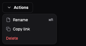
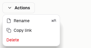
The menu is a small outlined button with a chevron; pressing it opens a popover under it with one link per item. Every item is a plain address, so the menu works without script and a choice is a page load. Esc or a click outside closes it.
Actions
A short list of links under its button.
Menu {
    id: "menu-row",
    label: "Actions",
    items: &[
        ("Open", "#open"),
        ("Duplicate", "#duplicate"),
        ("Export CSV", "#export"),
    ],
}Account
Menus name where each row goes.
Menu {
    id: "menu-me",
    label: "Maya Chen",
    items: &[
        ("Account", "#account"),
        ("Billing", "#billing"),
        ("Sign out", "#sign-out"),
    ],
}Views
Two or three rows are enough for a menu.
Menu {
    id: "menu-view",
    label: "View",
    items: &[("Table", "#table"), ("Board", "#board")],
}On the Mac
The same vocabulary drawn by Ocean UI's native face (egui on Metal), as the gallery's snapshot.
Use it
Web
use ocean_ui_web::{Menu, to_html};
to_html(&Menu { id: "more", label: "More", items: &[("Export", "/export"), ("Settings", "/settings")] })Native
use ocean_ui_native::{containers::{Menu, MenuItem}, egui::Id};
let items = vec![MenuItem::new("Copy link", "chat.copy"), MenuItem::new("Delete", "chat.delete").danger(true)];
let picked = Menu { id: Id::unique("gallery.menu"), items }.show(ui, &anchor);Cargo feature base of ocean-ui-core, ocean-ui-web and ocean-ui-native; available since 2026-10-29.
Props
| Name | Type | Default | What |
|---|---|---|---|
id | &str | — | The panel's id; the button names it with popovertarget. |
label | &str | — | The words on the button. |
items | &[(&str, &str)] | — | The rows as (label, href) pairs, in the order shown. |
Accessibility
- The button says aria-haspopup="menu", and the panel is role="menu" with one menuitem link per row.
- The panel is the browser's popover, so Esc or a click outside closes it.
- Items are links that Tab moves through; there is no arrow-key movement between them.
Related
Markdown
The same page as Markdown, for an agent or a pull request.
# Menu
A button that opens a short list of links in a popover, one menu item per link.
The menu is a small outlined button with a chevron; pressing it opens a popover under it with one link per item. Every item is a plain address, so the menu works without script and a choice is a page load. Esc or a click outside closes it.
## Use it
Web:
```rust
use ocean_ui_web::{Menu, to_html};
to_html(&Menu { id: "more", label: "More", items: &[("Export", "/export"), ("Settings", "/settings")] })
```
Native:
```rust
use ocean_ui_native::{containers::{Menu, MenuItem}, egui::Id};
let items = vec![MenuItem::new("Copy link", "chat.copy"), MenuItem::new("Delete", "chat.delete").danger(true)];
let picked = Menu { id: Id::unique("gallery.menu"), items }.show(ui, &anchor);
```
Cargo feature `base`; since 2026-10-29.
## Props
| Name | Type | Default | What |
|---|---|---|---|
| `id` | `&str` | `—` | The panel's id; the button names it with popovertarget. |
| `label` | `&str` | `—` | The words on the button. |
| `items` | `&[(&str, &str)]` | `—` | The rows as (label, href) pairs, in the order shown. |
On the Mac:  
## Examples
### Actions
A short list of links under its button.
```rust
Menu {
id: "menu-row",
label: "Actions",
items: &[
("Open", "#open"),
("Duplicate", "#duplicate"),
("Export CSV", "#export"),
],
}
```
### Account
Menus name where each row goes.
```rust
Menu {
id: "menu-me",
label: "Maya Chen",
items: &[
("Account", "#account"),
("Billing", "#billing"),
("Sign out", "#sign-out"),
],
}
```
### Views
Two or three rows are enough for a menu.
```rust
Menu {
id: "menu-view",
label: "View",
items: &[("Table", "#table"), ("Board", "#board")],
}
```
## Accessibility
- The button says aria-haspopup="menu", and the panel is role="menu" with one menuitem link per row.
- The panel is the browser's popover, so Esc or a click outside closes it.
- Items are links that Tab moves through; there is no arrow-key movement between them.
## Related
- [Button](/ui/components/button.md)
- [Popover](/ui/components/popover.md)
- [Dialog](/ui/components/dialog.md)